

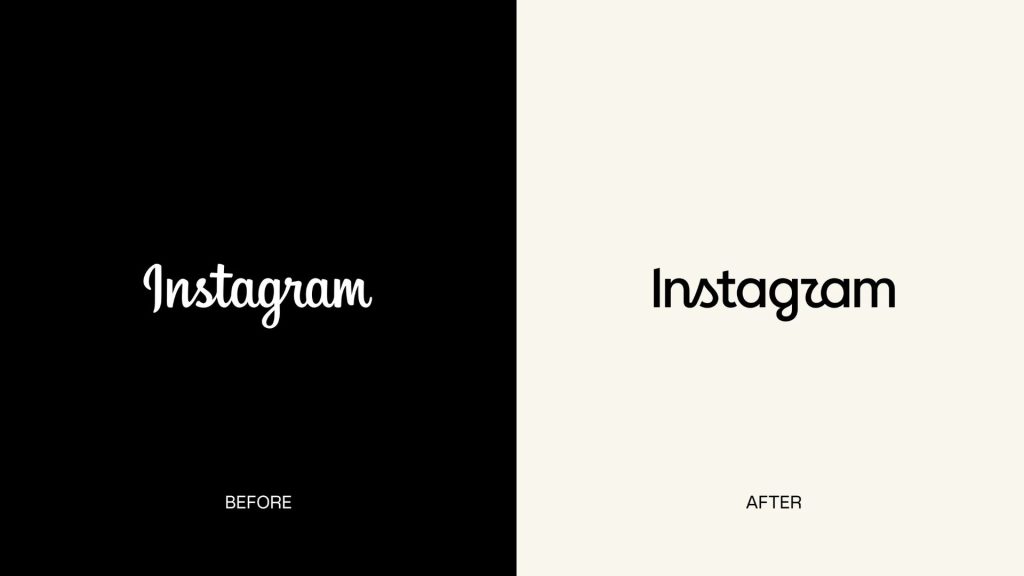
Instagram has refreshed the wordmark at the top of its app for the first time in a decade. Its familiar cursive logo now looks simpler and more modern, but whether the change actually needed to happen is another question.
Instagram head Adam Mosseri announced the new wordmark, saying the previous design had been unchanged for 10 years and was ready for a refresh. The updated version keeps the script-inspired character of the original, but it simplifies the lettering and makes it bolder.
It’s a subtle change, although some users have already found one particular detail difficult to ignore. The new lettering has prompted jokes that Instagram now reads “Instagzam”, thanks to the redesigned “r”.
Instagram says the change is part of a much broader brand refresh rather than simply a new logo. The company says it explored hundreds of possible directions, including all-caps designs, camera-inspired concepts and literal handwriting. Ultimately, it settled on a new wordmark rooted in the app’s original script style.
The aim, according to Instagram, is to make the brand feel more personal and expressive while remaining recognisably Instagram. The company describes the new wordmark as “bolder and simpler”, with the design intended to reflect individuality and self-expression.
The wider identity refresh also brings changes to Instagram’s typography, motion and layouts. The platform is introducing an updated Instagram Sans typeface, alongside new Instagram Pen and Instagram Mono fonts.
The familiar Instagram gradient isn’t going anywhere either, although the company says it will be used more subtly across the refreshed brand system. The updated visual language is intended to give users’ content more room to take centre stage rather than competing with it.
The new wordmark is already rolling out globally, while the rest of Instagram’s updated brand identity will follow throughout 2026 and beyond.
So, while the Instagram logo hasn’t exactly been reinvented, the company clearly thinks a decade was long enough for a refresh. Whether users agree may depend on how quickly everyone gets used to that new “r”.
The post Instagram just got a new logo and we’re not sure why appeared first on Trusted Reviews.